New Menu Navigation Is Live In Beta

Discussion in 'Official Announcements' started by avim, Feb 28, 2019.

  1. avim
    avim Shapeways Employee Product Team
    Hi everyone, in addition to our exciting news about launching Carbon, today we are also rolling out an incremental update to our menu navigation. This change intends to improve the experience for new users and make it easier to know exactly how to accomplish your goals on Shapeways as quickly as possible.

    Screen Shot 2019-02-28 at 10.18.52 AM.png

    Changing the way a website or application is used is never easy on existing users. We recognize that once you know where something is located, it can be frustrating to have to relearn it all. Nevertheless we are confident that this update will be quick to figure it out and within a couple of sessions of using it, you will be very comfortable with it.

    Key Changes

    1) Marketplace search box has been moved next to the logo. Our search still has lots of room for improvement, but for new users looking to find the marketplace it should now be much simpler to find.

    Screen Shot 2019-02-28 at 10.31.45 AM.png

    2) We have now grouped all menus together onto the right side of the page:

    Hover on Start Making to Upload new files, have a 3D file designed for you, or learn best practices for working with Shapeways and the materials we offer.
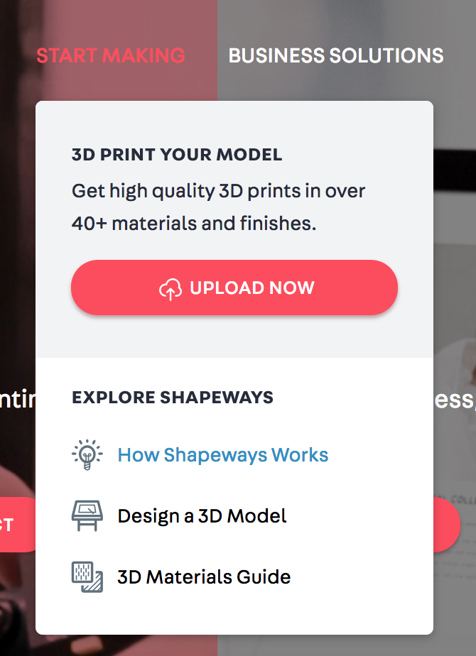
    Screen Shot 2019-02-28 at 10.15.29 AM.png

    3) Click on Business Solutions to learn more about how Shapeways can help power your 3D printing needs and speak with our sales team.

    4) Hover on your avatar photo to access all pages related to your account, including your models, order history and store information (if relevant). We also have currently grouped some of the public pages like our Help Center and Forum links under this section.

    Screen Shot 2019-02-28 at 10.17.39 AM.png

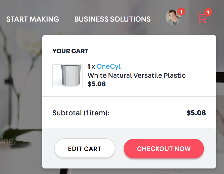
    5) Your cart has some minor tweaks, but should continue to function exactly as it did before.

    Screen Shot 2019-02-28 at 10.18.02 AM.png

    Product Iteration

    To set clear expectations, this navigation is a work in progress and represents a new way that the Shapeways development team will be working moving forwards, where we upload variants and iterations of all features (including exact copy, sizing, icons and more), see which performs best and continually tweak things until we feel they are fully optimized and performing well.

    When we introduce new major changes we will continue to update everyone.

    The end result should be a user experience that is simpler and clearer for all to accomplish their goals at Shapeways!

    If you experience any bugs with this experience, please do let us know in this thread.
     
    Last edited: Feb 28, 2019
  2. Echoco
    Echoco Well-Known Member
    My first 5-minute impression is this looks good, nice and clean.

    Don't take it personally though but this is the last day of the month and feels like Shapeways is changing stuff every month. Reminds me of a kid with ADHD.
     
    avim likes this.
  3. rolsen01
    rolsen01 Well-Known Member
    As a beta user, once I realized where things were (beta users were never given these instructions, had to search out the changes on our own) I'm good with this change. Seems simpler. Still looking for that elusive search engine major upgrade.
     
    avim likes this.
  4. avim
    avim Shapeways Employee Product Team
    I am actually happy to hear that. :) Hopefully none of these changes are too disjointing and now you know we are making regular progress towards (hopeful) improvement. As a development philosophy, we are going to continue to make changes, hopefully faster and quicker as we get smarter about knowing what's working.
     
  5. adbinc
    adbinc Well-Known Member
    I was in the middle of adding a new ship when I found out that things had changed. I admit that I had a moment of "Oh Bad Word, where is the nine box thing?" However, I went straight to where the content actually moved to, so that suggests the design is a good one. Ah, and the mysterious Shop Settings symbol now has a label. That should help new designers a lot.

    I am also happy with the more prominent (and self-explanatory) marketplace search box. That makes my marketing heart happy.

    Now to teach my muscles new memories. :)

    Jean
     
  6. Giorgio_Montagner
    Giorgio_Montagner Well-Known Member
    in the first minutes I had to get used to this new layout, but it looks good and easy to use.
     
    avim likes this.
  7. TrentTroop
    TrentTroop Well-Known Member
    It needs a one-click upload a model option.
     
  8. MitchellJetten
    MitchellJetten Shapeways Employee CS Team
    The "start making" is a hover, which expands Upload now function.
    upload_2019-3-1_10-31-39.png

    Or are you looking for an actual button in the top navigation of the website for uploading?
     
    avim likes this.
  9. barkingdigger
    barkingdigger Well-Known Member
    I haven't had much time to look around the new web page, but at first glance it finally looks like it was designed by a grown-up Not being part of the beta group I did have to poke around for the tools that were in the now-gone "nine squares" icon, but with the help of some useful info in this thread I found the main ones fairly quickly. It all seems more intuitive, which I assume is the goal - allowing newbies to find what they need without having to amass years of experience like us old hands. But please tell me this is it for radical change - we're all getting battle-fatigue with the constant changes SW has thrown at us these past six months...
     
    avim likes this.
  10. avim
    avim Shapeways Employee Product Team
    We're going to be iterating constantly, but doing so in a more thoughtful test-driven way. My goal is to help improve the business and that means measuring performance across the board, finding performance gaps, and thoughtfully introducing changes to address them.

    To that end, there will be more change to come. Where possible, it will be incremental, iterative and not jarring. Most people will not even notice... But where necessary, we will do what we have to do to improve things and fix areas of the business and user experience we objectively determine to be broken. We will do what we can to communicate with our customers in these circumstances, to help avoid any confusion.
     
  11. TrentTroop
    TrentTroop Well-Known Member
    Okay, the hover-menu lets me open multiple tabs at once (I do variants, most of my items have 2-5 of them), so that should work, but a link in the menu with all the other options would seem intuitive.
     
  12. MrNibbles
    MrNibbles Well-Known Member
    It took me a short while to find the upload page button as well. There may be a reason for it but the upload prompt on the My Models page doesn't bring up the same page that eventually shows the model parameters and pricing. Instead the My Models page uploads the model and continues to show the My Models page. Is the My Models page set up the way it is to allow multiple upload files to be dragged to the prompt or something?
     
  13. adbinc
    adbinc Well-Known Member
    The My Models page is what I have used to upload files all along. Set the measurement (MM o IN), drag the file there and release. Then grab another file and drop it in that area. I usually do four files at a time. I wait until I get the notice the models are ready, go back to that tab, and reload it. There they are!

    Jean
     
  14. Moms_Sphagetti
    Moms_Sphagetti Well-Known Member
    Hi MrNibbles,

    Correct! As adbinc mentioned, in the my models page, you can actually drag multiple model files right to the upload area so multiple models are uploaded simultaneously! This is why we have a separate upload page as well if you only want to upload one model instead.

    All the best,
     
  15. javelin98
    javelin98 Well-Known Member
    Definitely moving in the right direction!
     
    Moms_Sphagetti and catslady123 like this.
  16. ecs_norway
    ecs_norway Well-Known Member
    Definitely moving in the wrong direction.

    Having every relevant control hidden behind a hover that isn't called out or highlighted or otherwise differentiated from background is effectively a nonfunctional site.

    Even the forums are difficult at this point with the outlines of the text box for post input and the upload/more options buttons almost completely invisible.
     
  17. RayP1949
    RayP1949 Member
    You need to put the Shop Now button up next to the Search field. At the moment it is hidden and new visitors have to realise that they must scroll down to find it. While the Search is useful if you know what you are looking for, the average potential customer who wants to browse to see what is available may not find the Shop Now button. Shapeways is hurting itself with this as it has been for the last number of months.
     
    Malwen likes this.
  18. woody64
    woody64 Well-Known Member
    adbinc likes this.